PROJECT
Site Uber Navigation
SUMMARY
Design & globalize the Header area for 6 individual Quidsi websites.
ISSUE
The Header on each Quidsi website has had a distinct design per its individual site brand. Six sites means the experience & interactions for each Header were related, but visually different different.
Also, the original Header design only accounted for a desktop experience. As Quidsi site philosophy shifted to mobile device consideration, it was now time to consider the future of all sites - Responsive layouts and content. The existing design did not and would not support a future responsive design. Thus, it was time for a change!
SOLUTION
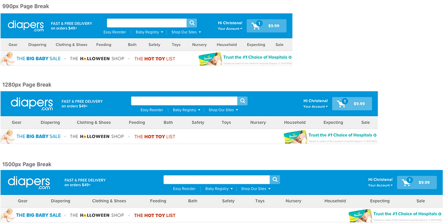
I took the Responsive mindset to conceive a design born out of the question: "what would the Header look like if it was a responsive page breaks beyond 1025 pixels?"
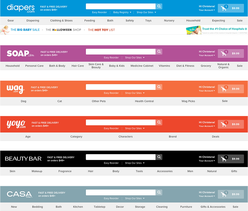
The concept started with the tablet web display header. Initial UI experiments outlined a natural progression from the tablet page break at 768+ and how that would extend to a desktop browser page break. The highlight decision from these efforts was to globalize the Header design across ALL sites. The only differentiator would be the Header color & styling to account for each site's brand. Otherwise, each site UI would maintain a consistent layout and display.
PLATFORMS
Desktop
ROLES
Research & Analysis
UI Design
UX Manager
User Test Moderator
TEAM
Jessica Xu - UX/UI Designer
TOOLS
Paper Wireframes
Sketch
Silverback
SITE HEADER - FINAL DESIGN

DESIGN COMPS

FINAL DESIGN - RESPONSIVE BREAK POINTS
DETAIL DESIGN ELEMENTS
These dropdowns allow for maximizing space in the header. Staying lean requires some tidying up.
UI Design by Jessica Xu

CONCLUSION
The new site Headers went live on all 6 Quidsi websites in early January 2017. Our primary goal was to watch analytics to ensure there was no drop off to our existing user base. We successfully concluded after 2 months of live use that the Header did not decrease use across our sites or affect any critical business funnels. WIN!
Unfortunately, the new Headers only lived for 4 months as Quidsi turned out the lights on all 6 sites as of 4/19/2017.
However, I realized a 5 year goal of mine... I got to redesign the antiquated site Header!!!
GLOBAL DISPLAYS
Took the individualism of each site and globalized it with a streamlined style. Brand color is strong and looking modern!
